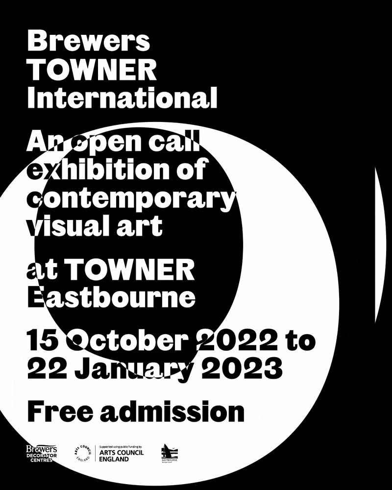
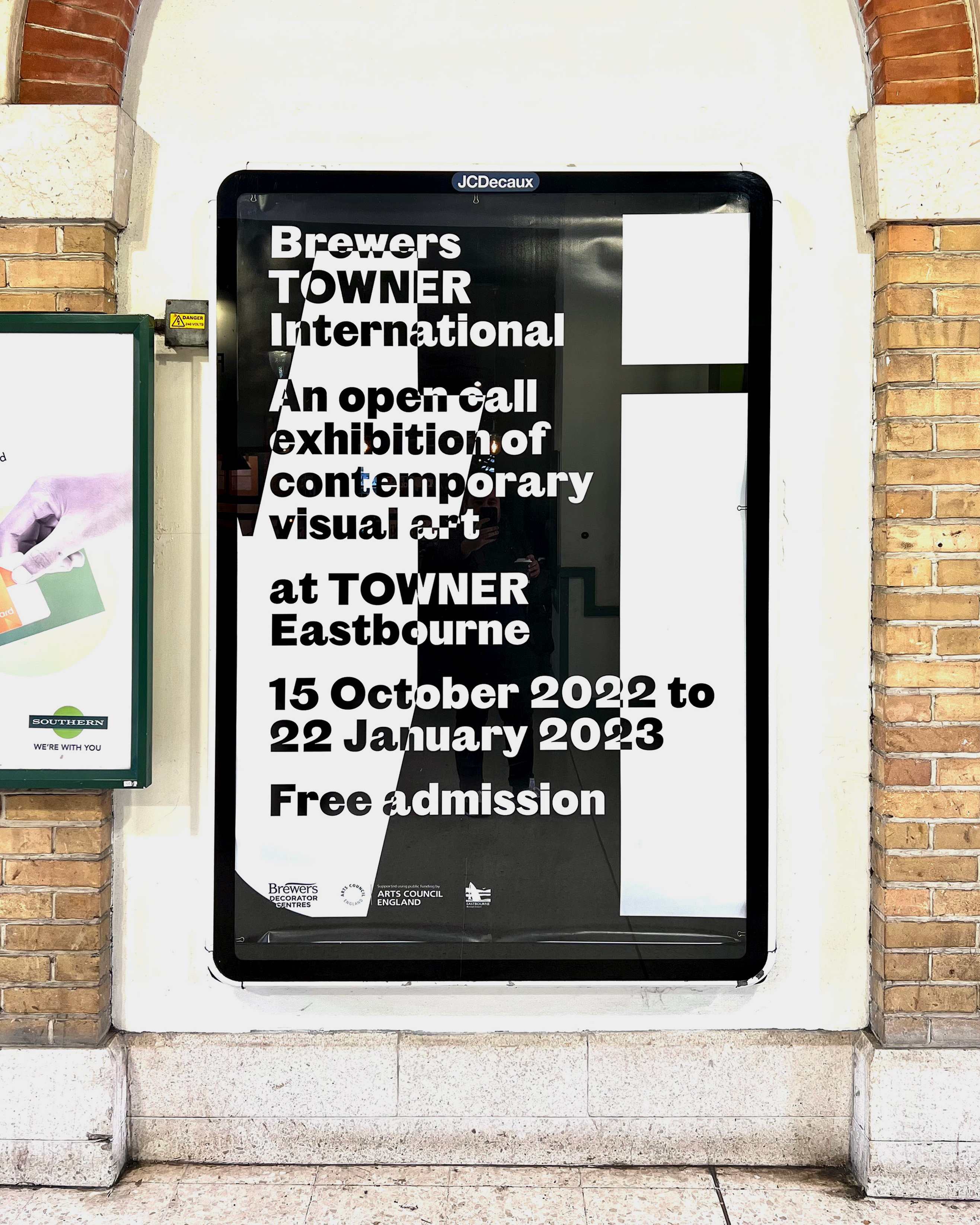
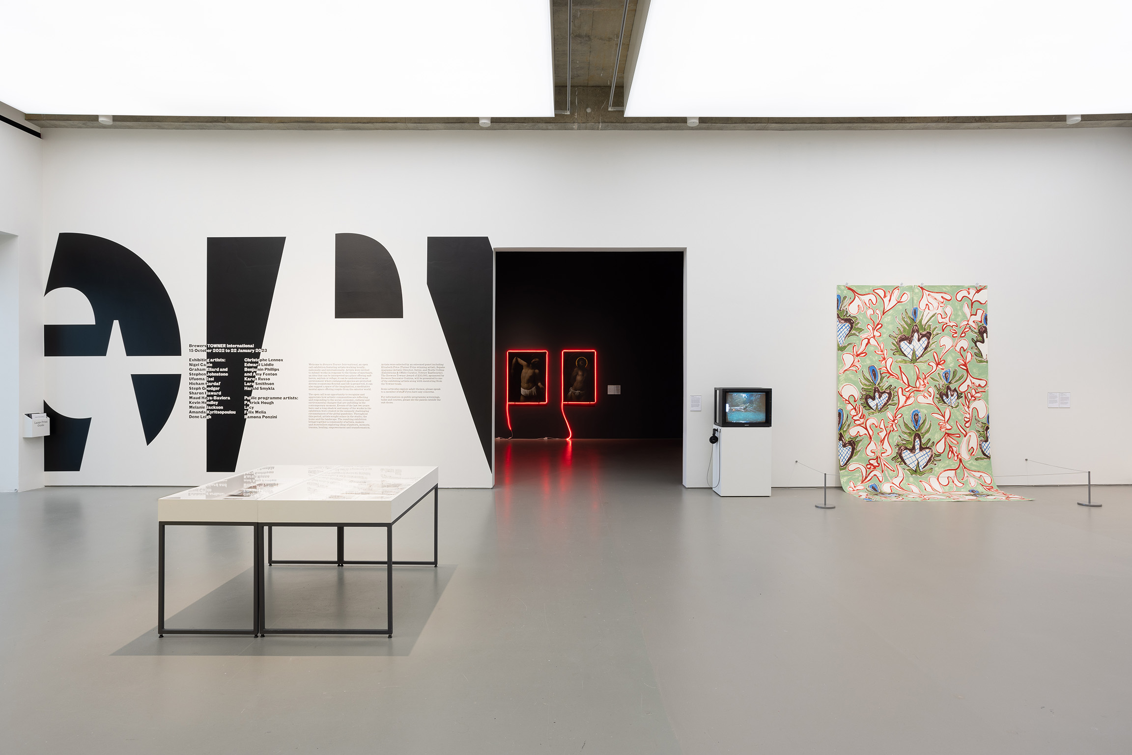
Using bold, dominant type atop a black and white inverting colour scheme, we presented the Towner gallery’s second installment of their open call exhibition with a memorable graphic system.
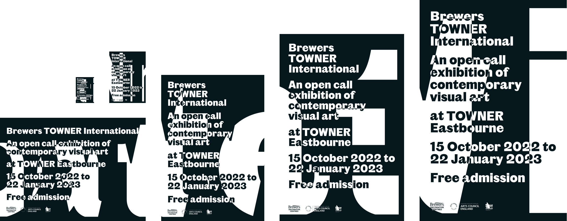
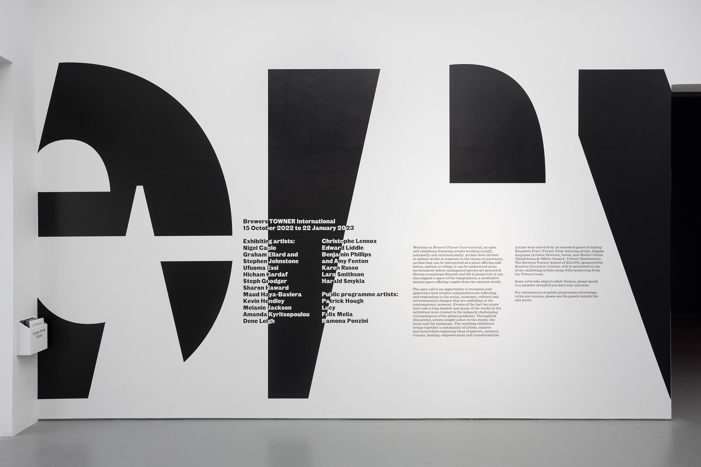
The overlapping and silhouetting of ‘TOWNER’ and ‘International’ created a range of graphic shapes that could be animated for digital contexts, or used to create a unique frame for each printed deliverable.
A conscious decision to contrast the look of this event with the gallery’s usual graphic output (which is abundant in colour), ensured that the exhibition stood out from the rest of their calendar.

This project is by Elliot Ellis and Fraser Muggeridge, as part of a project undertaken at Fraser Muggeridge studio.