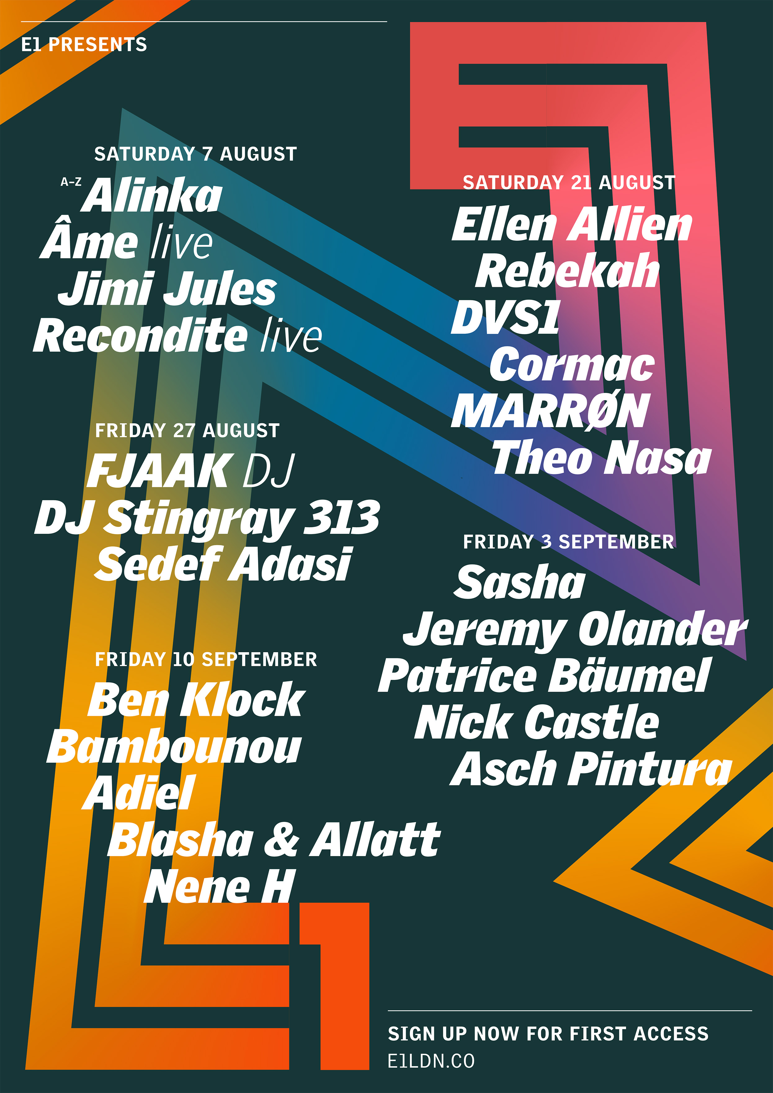
After an extremely fortunate survival through the Covid-19 pandemic, electronic music venue E1 relaunched with a fresh vision and direction for its internally-promoted series of events, ‘E1 Presents’.
For the first season of shows, I designed a collection of flyers that would showcase this sense of evolution, represent a newfound concentration on inclusivity, and keep E1 itself as the backbone of the brand.
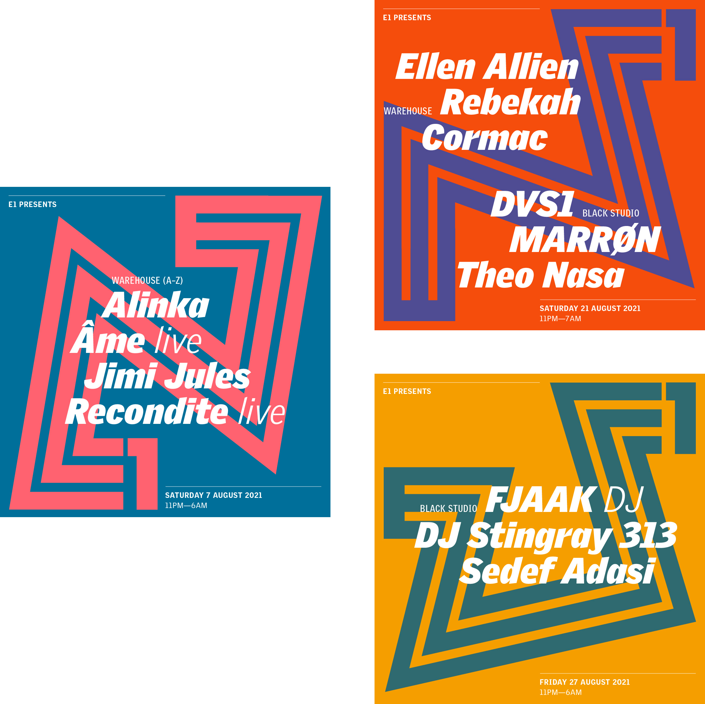
The implicit motion of the design acts as its strongest component, portrayed through the zig-zagging morph of the venue’s logo, and the strong italicised typography of the artist names.
This motion, combined with the bright and bold colour schemes, ensures that the design meets its desire to present evolution and inclusivity in a striking manner.