This magazine started as a blog ran by myself and Chris Daunt, and transformed into a concept for a print publication as part of a university project.
In an age of capitalism-driven streaming algorithms and mass-produced throwaway playlists spiralling out of control, I wanted to hit reset; to promote music as a precious, meaningful experience.
Through curating existing content and even writing some, an editorial tone was designed to embrace music that drifts towards the weird yet wonderful; the futuristic but now.
A visual identity was developed alongside the editorial tone so that the writing and the graphics worked together harmoniously. I developed a layout and typographic system that would be methodical yet allowed freedom for experimentation.
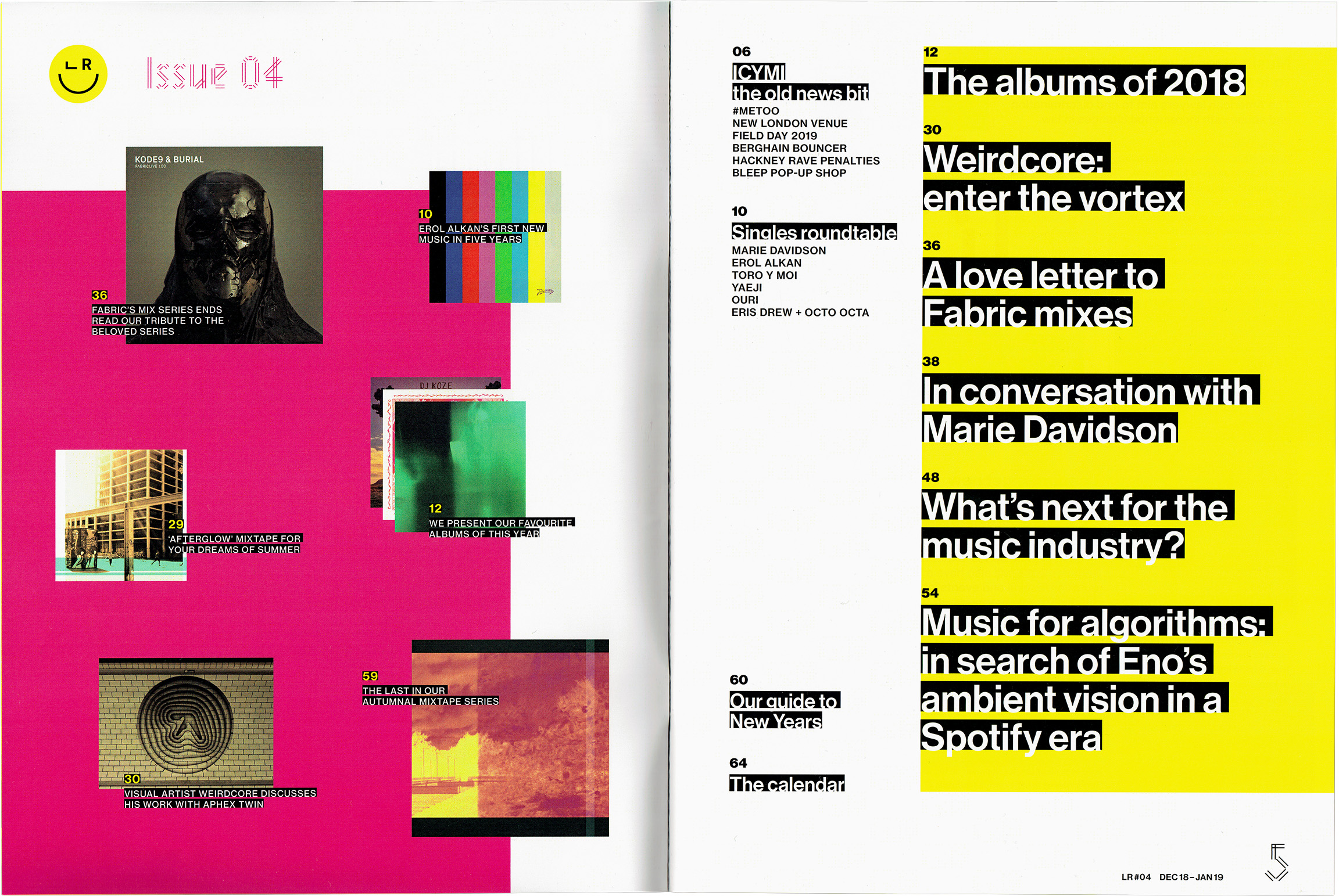
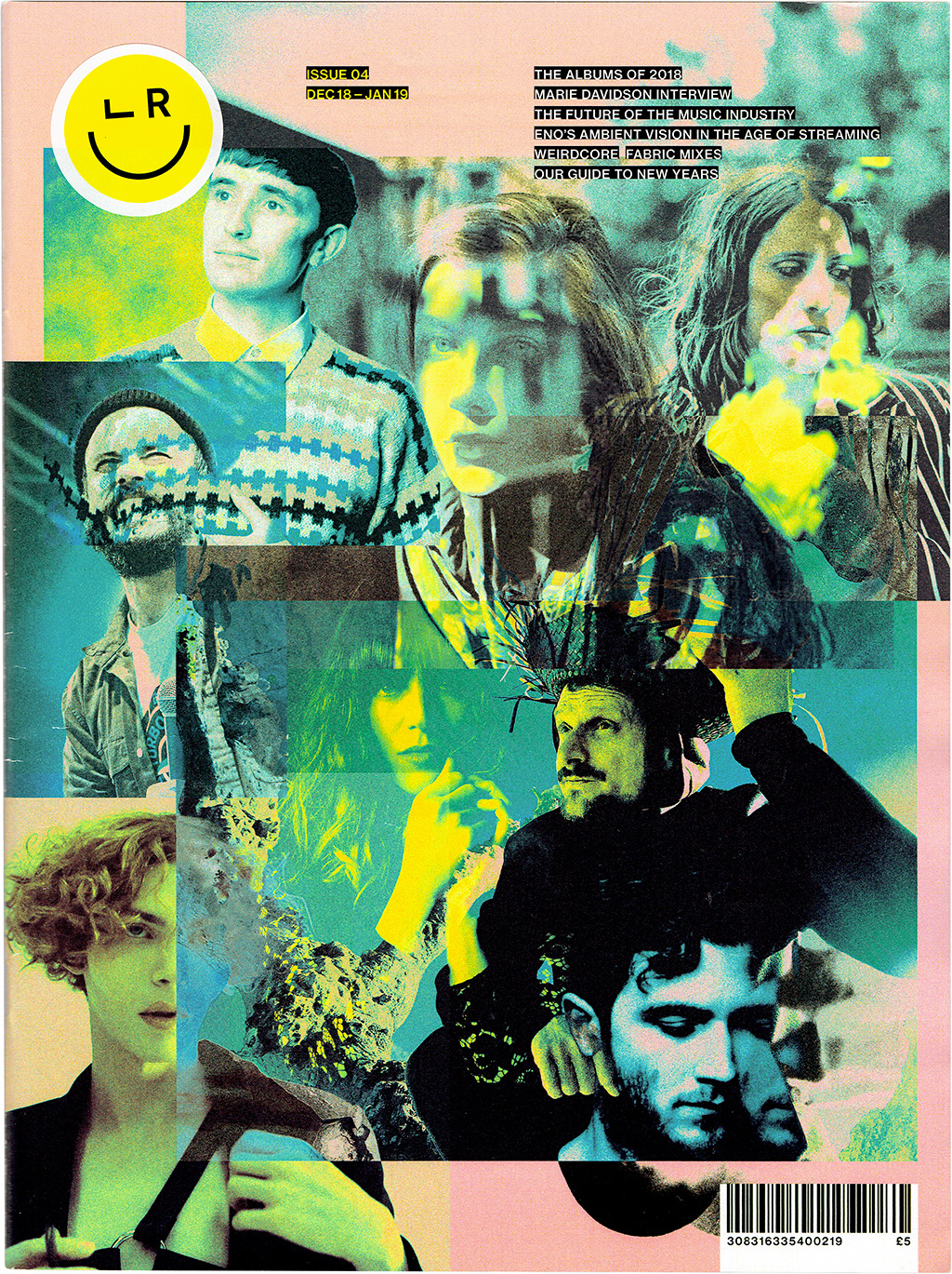
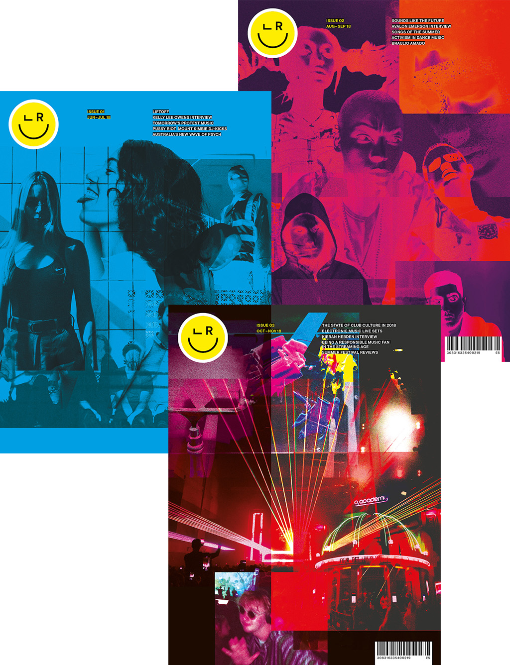
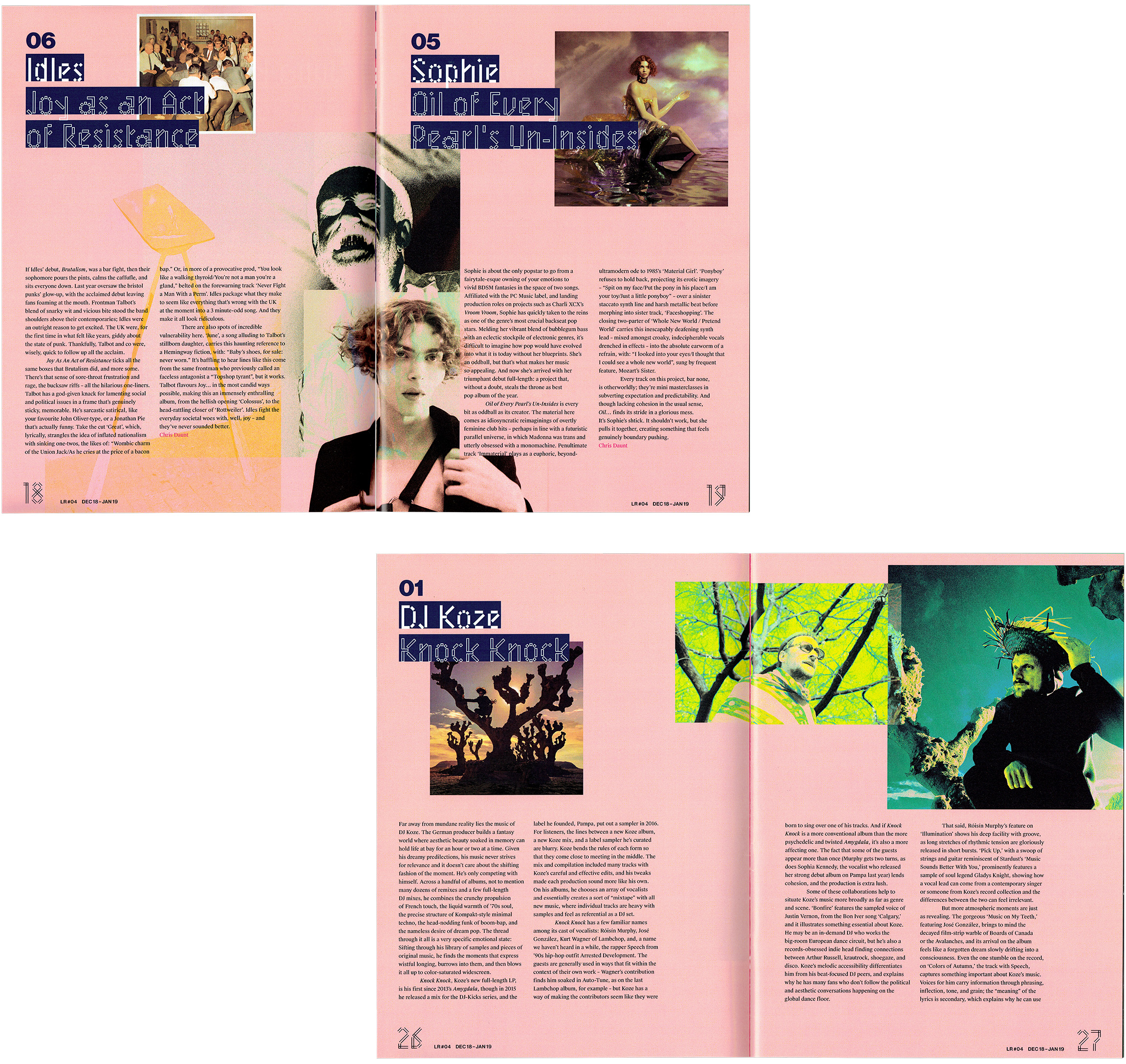
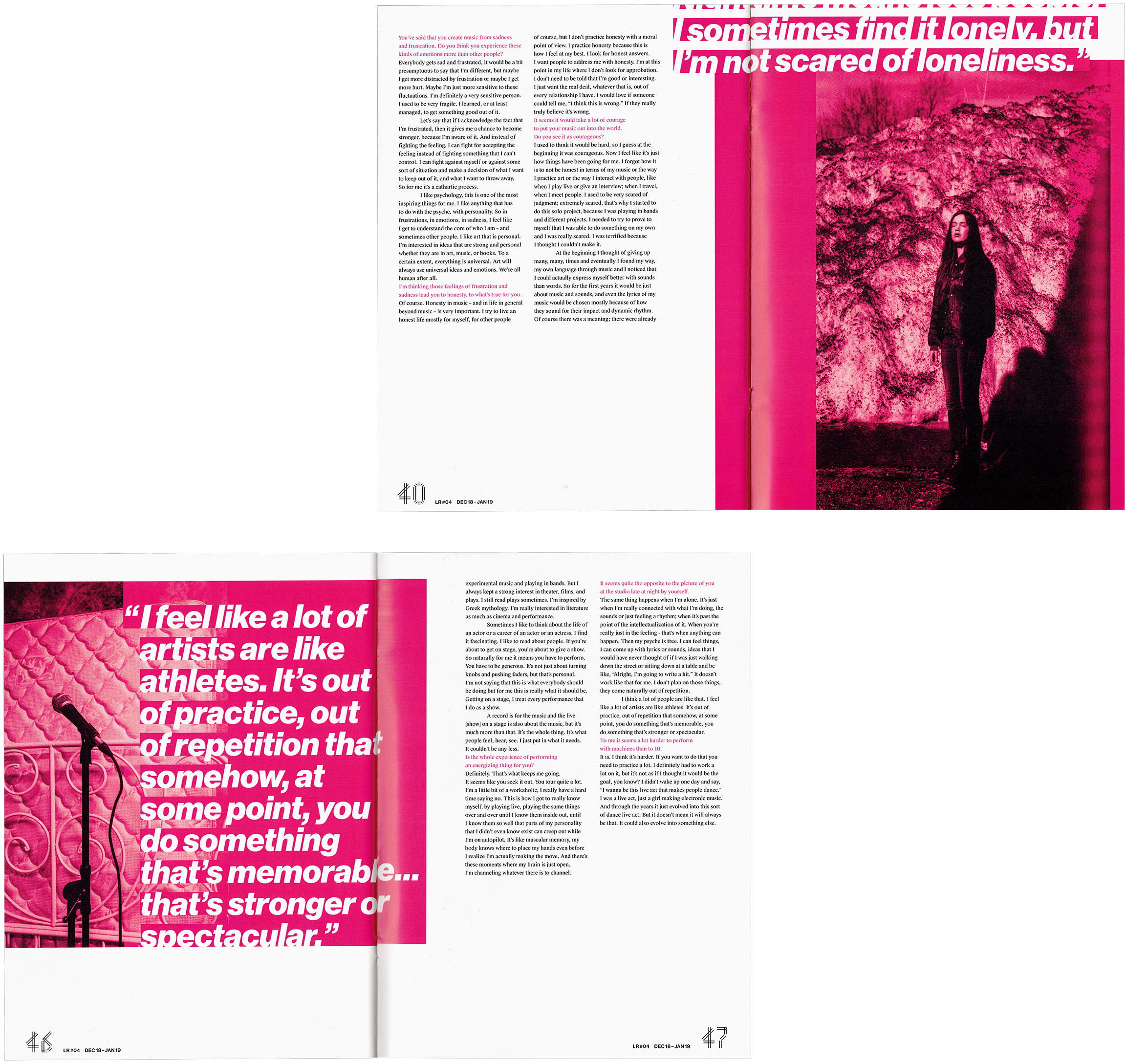
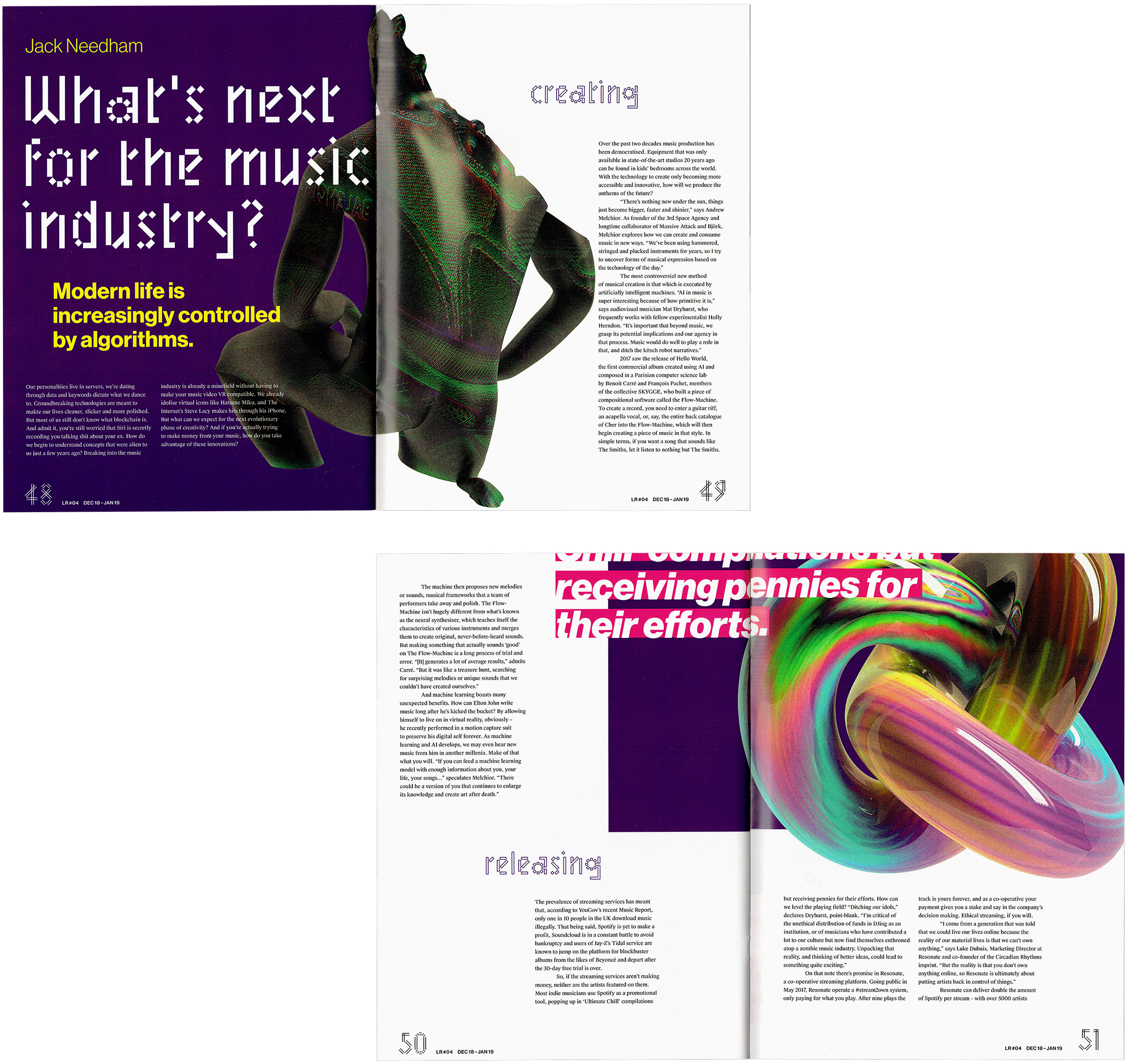
The bright yellow from the logo forms as a key identifier for the preliminary sections of the magazine, and pairs with the bold magenta to introduce a fun yet contemporary look and feel from the outset.
Paired back heading and body type choices allow the unique display face to shine, adding a bunch of charisma. Playful arrangement of imagery adds chaos to an otherwise rigid grid structure.
68 printed pages in length, Listen responsibly remains a serious proof of concept for a music publication, with a purpose that is only growing more imminent by the year.
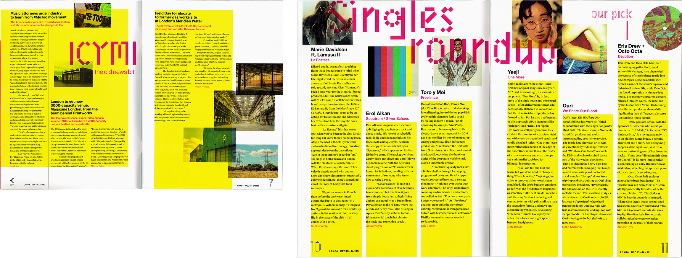
Content featured within the graphics on this page – including writing, photos, and some artwork – was taken from various sources including Pitchfork, Crack, Record Culture, and Resident Advisor. All such content is copyright of the original owner and is used here for academic demonstration purposes only, as part of a university coursework project.


